
Today’s organisations deal with a huge amount of data from different places. They need advanced tools to turn this data into useful information.
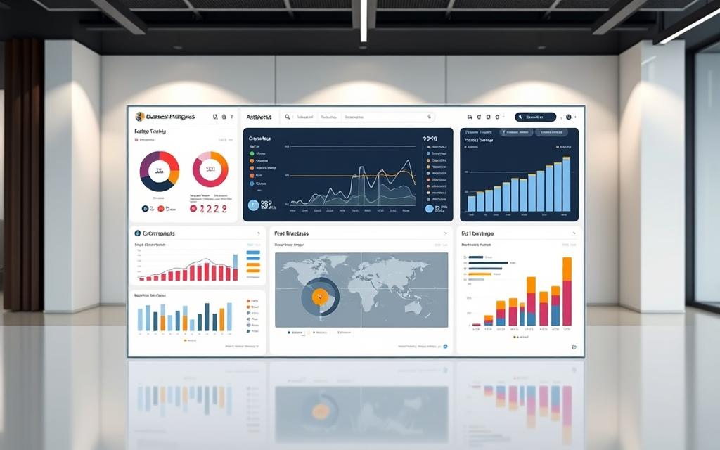
A technology dashboard is like your main control room for performance monitoring. It brings together data from various systems into one easy-to-use interface.
These data visualisation tools show complex data in simple ways. They use charts, graphs, and gauges to make it easy to understand.
Good dashboards give you a clear view of how your organisation is doing. They help spot trends, patterns, and problems fast.
The best part is having all important business metrics on one screen. This business intelligence dashboard helps everyone make quicker, smarter decisions.
What is a Technology Dashboard
Technology dashboards are advanced visual tools that turn complex data into useful business insights. They act as central hubs for organisations to track and improve their performance.
Core Purpose and Functionality
The main job of a technology dashboard is to make complex data easy to understand. It collects data from various sources and shows it in simple, visual ways.
Today’s dashboards are great at showing real-time data. This helps organisations make quick decisions and plan their strategies better.
A good interactive dashboard lets users dive deep into data, filter it, and see how different parts relate. This helps teams spot chances and solve problems early.
Related Posts:


Key Characteristics of Effective Dashboards
Good technology dashboards have key features that set them apart. These features help them add value to businesses in many fields.
One key feature is KPI tracking. Dashboards should clearly show important performance metrics. This makes it easy to see how close you are to your goals.
Another important feature is combining data from different systems. Great dashboards bring together data from sales, marketing, operations, and finance into one place.
| Characteristic | Description | Business Impact |
|---|---|---|
| Real-time Updates | Continuous data refresh from connected sources | Enables immediate response to changing conditions |
| Customisable Layout | User-configurable widgets and visualisations | Tailors information to specific user needs |
| Interactive Elements | Clickable charts, filters, and drill-down options | Facilitates deeper data exploration and analysis |
| Mobile Accessibility | Responsive design for various devices | Ensures access to critical information anywhere |
| Alert Systems | Automated notifications for threshold breaches | Proactively identifies issues requiring attention |
The table shows how different features help a dashboard succeed. Each feature is important for turning data into useful insights.
Good dashboards focus on making things easy for users. They show the most important info clearly and let users explore more through interactive dashboard features.
These tools also make sure data is easy to understand. They use the right charts, colours, and layout. This makes complex real-time data easy for everyone to get.
Benefits of Using a Technology Dashboard
Companies in many fields are seeing big benefits from using technology dashboards. These tools turn raw data into useful insights. This helps businesses of all sizes add value.
Technology dashboards act as central hubs for information. They make processes smoother by combining different data into one place.
Enhanced Decision-Making Capabilities
Today’s business world needs fast, accurate decisions. Technology dashboards give managers real-time data. This makes planning clearer.
These systems let decision-makers see key performance indicators right away. They can spot trends, find new chances, and solve problems quickly.
The dashboards make complex data simple to understand. With colour-coded metrics and easy-to-read graphics, teams can get the picture fast.
This makes for informed decisions based on up-to-date info, not old reports. Companies can adapt to market changes quicker.
Technology dashboards help make data-driven decisions in every area. From marketing to managing stock, every choice is better with current data.
Improved Operational Efficiency
Technology dashboards help achieve top performance. They find problems and show where to improve.
Managers can see how things are going without needing reports. They can check on team work, how resources are used, and process quality in real time.
Dashboards also help teams work together better. Everyone can see important info. This makes it easier for departments to work as one.
This leads to big workflow improvement across the company. Teams spend less time looking for info and more time doing their jobs.
The table below shows how dashboards help different parts of the business:
| Operational Area | Before Dashboard | After Dashboard | Improvement Percentage |
|---|---|---|---|
| Data Collection Time | 4 hours daily | 30 minutes daily | 87.5% reduction |
| Decision-Making Speed | 2-3 days | 2-3 hours | 90% faster |
| Cross-Department Alignment | Weekly meetings | Real-time updates | 100% improvement |
| Error Identification | Post-process discovery | Immediate detection | 95% faster resolution |
Technology dashboards help companies always get better. They can try new things and see how they work right away.
Being able to change quickly based on live data changes how companies run their day-to-day. This quickness is a big plus in fast-changing markets.
Essential Components of a Technology Dashboard
Creating a good technology dashboard needs careful thought about its main parts. These parts work together to turn data into useful insights that guide business choices.
Data Visualisation Elements
Visual elements are key to any dashboard. They make complex data easy to understand. This helps users spot patterns, trends, and oddities quickly.
Charts and Graphs
There are many types of visual elements for different needs. Bar charts are great for comparing things. Line graphs show trends over time well. Pie charts are good for showing parts of a whole, and scatter plots show how things relate to each other.
Choosing the right charts and graphs is key. It lets your audience quickly get the message you’re trying to share.

KPIs are the key numbers that show how well your organisation is doing. They help track how you’re doing against your goals.
A good KPI dashboard focuses on the most important numbers. It shows targets, current numbers, and how things have changed over time.
Good KPIs have a few things in common:
- They’re important for your business goals
- They’re easy to measure
- They’re updated regularly
- They give useful insights
Data Sources and Integration
The quality of your dashboard’s insights depends on the data it uses. Today’s businesses often use data from many places.
These places include CRM systems, ERP tools, marketing software, and financial apps. Each one adds something special to the big picture of your business.
The data integration process has a few key steps:
- Gathering data from different sources
- Putting it all together in one place
- Cleaning it up to get rid of mistakes
- Changing it so it all fits together
This thorough method makes sure your dashboard shows accurate, dependable info. This info is what stakeholders need to make good decisions.
Types of Technology Dashboards
Technology dashboards vary, each meeting specific business needs. Knowing these types helps pick the best dashboard for your needs.
There are main categories like operational and analytical dashboards. Strategic and informational types also help manage data well.
Operational Dashboards
Operational dashboards focus on operational monitoring in real time. They show current performance, helping teams act fast on issues.
Key features include:
- Live data feeds updating every few seconds or minutes
- Alert systems for threshold breaches or abnormal patterns
- Simplified visualisations for quick comprehension
- Focus on current performance, not past trends
They’re great for places needing quick action. Customer service and manufacturing use them to track performance live.
Analytical Dashboards
Analytical dashboards are analytical tools for deep business insights. They look at past data, patterns, and trends.
They have:
- Access to large historical datasets
- Advanced filtering and drill-down capabilities
- Complex visualisations for detailed analysis
- Support for predictive modelling and forecasting
Business analysts use them for strategic planning. Marketing and finance teams look at data to guide decisions.
Operational dashboards tell you “what’s happening now.” Analytical ones explain “why it happened and what’s next.” Many use both for immediate needs and long-term planning.
Implementing a Technology Dashboard in Your Organisation
Getting a technology dashboard right needs careful planning. A good plan helps your organisation get the most out of it. It also helps avoid common mistakes.

Steps for Successful Deployment
Start with clear goals. Know who will use the dashboard and what they need to decide. Then, pick the right metrics and visuals.
Here’s a step-by-step guide for the best results:
- Identify stakeholders and requirements – Know who will use the dashboard and what they need to decide
- Select appropriate data sources – Choose systems that give accurate, up-to-date info
- Design visualisations strategically – Use charts that fit your data and what users like
- Maintain simplicity in design – Keep it clear, don’t overload it with too much info
- Implement feedback mechanisms – Let users suggest changes and report problems
This careful approach makes sure your dashboard meets real business needs. It’s not just another tech project.
Common Pitfalls to Avoid
Even with good plans, things can go wrong. Knowing the risks helps you deal with them better.
The biggest dangers are:
- Inaccurate or unreliable data – Bad data makes the dashboard useless
- Overcrowded visualisations – Too much info confuses, not clarifies
- Misaligned stakeholder expectations – Not giving users what they really need
- Insufficient training and support – Users can’t use tools they don’t get
- Neglecting ongoing maintenance – Dashboards need updates as needs change
Fixing these issues early on boosts your chances of success. Regular checks and user feedback are key to spotting problems early.
Remember, technology dashboards grow with your organisation. The first step is just the start of a journey of improvement.
Best Practices for Dashboard Design
Creating a good technology dashboard needs careful thought about how it looks and how accurate the data is. The best dashboards are both pretty and reliable. They let users get to the right information fast, helping them make better decisions.
User-Centred Design Principles
Knowing your audience is key to great dashboard design. People with different skills and needs use dashboards. For example, bosses might want a quick overview, while experts need to dive deep into the data.
Keeping things consistent in layout and colours makes for a better user experience. Make sure the most important info is easy to see first. Use colours like red for warnings and green for good news, and stick to it everywhere.
Don’t clutter your dashboard with too many widgets or data points. Each item should have a clear role and help tell the story. Remember, empty space is not a bad thing – it helps users focus.
For more tips on making your dashboards better, check out these dashboard design principles. They can change how people use your data visualisations.
Ensuring Data Accuracy and Relevance
Trust in your dashboard’s outputs starts with good data. Use strong data validation at every step of your data flow. Set up automated checks to spot any problems before they show up on the dashboard.
Make sure who owns the data and who updates it is clear. Assign team members to check data sources and keep things up to date. Keep records of these steps to keep things consistent, even when team members change.
Check in with stakeholders regularly to see if your dashboard is up to date. Business needs change, and so should your dashboard. Remove old metrics and add new ones that are relevant now.
Use version control and track changes to your dashboard. This lets you see who made what changes and go back if needed.
Challenges in Dashboard Implementation
Technology dashboards bring many benefits, but they also face big hurdles during setup. These challenges can stop even the best plans if not tackled early on.

Data Security Concerns
Keeping sensitive data safe is a top challenge. Dashboards gather data from many places, making them a target for hackers.
Strong security steps are needed to protect this data. Using two-factor authentication is key to controlling access to dashboard data.
Data encryption helps protect it when it’s stored or moving. Regular security checks find and fix weaknesses before they’re used by hackers.
“The mix of data in dashboards offers chances and security duties that must be taken seriously.”
Following data protection laws adds more complexity. Each industry has its own rules that must be followed in dashboard security.
| Security Measure | Implementation Requirement | Risk Mitigated |
|---|---|---|
| Role-Based Access Control | Define user permissions hierarchy | Unauthorised data exposure |
| Data Encryption | Implement TLS/SSL protocols | Data interception during transmission |
| Audit Logging | Track all user interactions | Unauthorised system changes |
| Regular Security Updates | Patch management schedule | Vulnerability exploitation |
User Adoption Barriers
The biggest challenge often lies with people. Even the best dashboards fail if users don’t use them.
Too complex visuals can confuse users. If dashboards are hard to understand, people go back to old ways.
Not training users well makes things worse. They need to know how to use the dashboard and how it helps them.
It’s important for dashboards to show insights that matter to users. They should focus on what users need, not just general data.
- Resistance to change from established work patterns
- Insufficient training on dashboard functionality
- Irrelevant metrics that don’t support decision-making
- Performance issues that frustrate users
Success comes from tackling these people issues through change management. Getting users involved early helps them accept the dashboard.
Keeping users engaged means listening to their feedback and making changes. When users see their ideas used, they’re more likely to use the dashboard.
Popular Technology Dashboard Tools
Choosing the right platform is key for good data visualisation and analysis. The market has many business intelligence tools, each with its own strengths. This section looks at two leading solutions that change how organisations work with their data.

When picking dashboard solutions, think about integration, user experience, and how it scales. The best choice depends on your organisation’s needs, current setup, and technical skills.
Tableau
Tableau software is known for its top-notch visual analytics. It lets users make interactive and attractive dashboards easily, without needing to code. Its drag-and-drop interface is easy for both tech-savvy and non-technical users.
Tableau is great at handling complex data visualisations. Users can spot patterns, trends, and outliers easily with its charts and graphs. It supports real-time data analysis and has lots of customisation options for reports.
Tableau connects well with many data sources. It works with:
- Cloud databases and data warehouses
- Spreadsheets and local files
- Web data connectors
- Big data platforms
Microsoft Power BI
Microsoft Power BI is great for big organisations, mainly those using Microsoft products. It fits well with the Microsoft ecosystem, including Office 365, Azure services, and SQL Server. This makes it easy for users who know Microsoft’s tools.
Power BI has strong data modelling through Power Pivot. Users can build complex data models and link different data sets. Its natural language query feature lets users ask questions in simple English.
Microsoft’s solution is good value, with flexible pricing. The free version has a lot of features, and the Pro and Premium versions are for bigger organisations with more needs.
| Feature | Tableau | Microsoft Power BI |
|---|---|---|
| Primary Strength | Advanced visual analytics | Enterprise integration |
| Learning Curve | Moderate to steep | Gentle for Microsoft users |
| Pricing Structure | Higher initial cost | Flexible subscription model |
| Best For | Complex data visualisation | Microsoft ecosystem users |
| Mobile Support | Excellent cross-platform | Strong native apps |
Both platforms are top choices in the business intelligence tools market. Tableau is best for organisations needing advanced visual analytics. Microsoft Power BI is great for those in the Microsoft environment. Readers exploring dashboard visualizing data often end up considering blockchain decentralization cryptography as part of the same topic. Your choice depends on your needs, budget, and current setup.
Other providers like Domo also offer good solutions, mainly for all-in-one business intelligence platforms. Each tool has its own benefits, so it’s important to evaluate them well before choosing.
Case Studies: Successful Dashboard Implementations
Real-world examples show how dashboards change industries. They help solve big problems and bring real results.

Retail Sector Example
Big retail names have changed how they work with dashboards. A top UK store used a smart analytics system to make better choices.
The system used data from:
- Point-of-sale systems tracking real-time sales
- Inventory management databases
- Customer relationship management platforms
- E-commerce transaction records
This led to big wins. Stockouts fell by 23% and customer happiness went up by 18% in six months.
“Our dashboard gave us a clear view of what customers want and what’s in stock. We can now guess demand better than ever.”
The dashboard helped spot what’s popular, set prices right, and tailor ads to customers.
Healthcare Industry Application
Healthcare has its own set of challenges. A top NHS trust used a dashboard to tackle these issues.
Their system used data from:
- Electronic health records systems
- Appointment scheduling software
- Resource allocation databases
- Compliance monitoring tools
This effort paid off. Patient wait times dropped by 31% and bed use went up by 27%.
The dashboard let staff see how patients were doing and helped managers use resources better.
It also made tracking rules easier. It caught problems before they got worse.
| Metric | Retail Sector Improvement | Healthcare Sector Improvement |
|---|---|---|
| Operational Efficiency | 19% increase | 22% increase |
| Cost Reduction | 15% savings | 18% savings |
| Decision-making Speed | 40% faster | 35% faster |
| Compliance Accuracy | 28% improvement | 42% improvement |
These stories show how dashboards solve specific problems. Retail focuses on customers and stock, while healthcare looks at patients and rules.
These examples show dashboards bring real benefits. They help businesses work better, save money, and make smarter choices.
Future Trends in Dashboard Technology
Data visualisation is changing fast, thanks to new tech. Dashboards are becoming smarter, more responsive, and predictive. This will change how businesses use data across many industries.
Artificial Intelligence and Machine Learning Integration
AI and ML are changing dashboards. They go beyond showing data to predict and give insights on their own. These systems find patterns, forecast trends, and offer advice without needing humans.
Today’s dashboards use advanced algorithms. They learn from past data to guess what will happen next. This helps businesses see market shifts, customer habits, and what they need to do next.
“The integration of machine learning transforms dashboards from reactive reporting tools into proactive decision-making partners.”
Some big steps forward include:
- Automated anomaly detection and alert systems
- Natural language processing for voice-activated queries
- Predictive modelling for scenario planning and forecasting
- Personalised insights based on user behaviour patterns
Real-Time Data Processing Advances
People want insights right away. New tech makes real-time analytics better. Dashboards can now handle big data fast, giving up-to-the-second info for quick decisions.
New tech like in-memory computing and better compression has changed things. It lets dashboards do complex tasks without waiting. This means no more waiting for overnight updates.
Today’s real-time analytics include:
- 64-bit architecture handling larger data volumes
- Advanced compression reducing storage requirements
- Parallel processing capabilities for simultaneous operations
- Streaming data integration from multiple sources
| Technology Component | Current Capability | Future Potencial |
|---|---|---|
| In-Memory Processing | Handles terabytes of data | Petabyte-scale processing |
| Data Compression | 50-70% reduction in size | 80-90% efficiency rates |
| Processing Speed | Millisecond response times | Microsecond analytics |
| Concurrent Users | Hundreds of simultaneous users | Thousands without performance impact |
These changes mean dashboards will soon be even smarter and faster. Businesses that use these new tools will make better decisions. They’ll stay ahead of the competition.
Conclusion
Technology dashboards are a big step forward in how we see and use our data. They turn complicated info into easy-to-understand insights. This helps teams make smart choices with confidence.
Good dashboards create a culture that relies on data, not just guesses. They show how well different parts of the organisation are doing. This lets leaders spot trends, find new chances, and fix problems early.
As data gets bigger and more important, using dashboards is key to staying ahead. Companies that use these tools can change fast to meet market needs. Dashboards are not just for reports; they’re tools for real change in how a business works.
FAQ
What is a technology dashboard?
A technology dashboard is a visual tool that shows important business data in real time. It turns raw data into useful insights. This helps organisations track their performance and make smart decisions quickly.
What are the key benefits of using a technology dashboard?
Dashboards help make better decisions by showing real-time data clearly. They also make operations smoother by improving workflows and teamwork. This allows for quick changes based on current data.
What are the essential components of a technology dashboard?
Key parts include data visualisation tools like charts and KPIs. Also, strong data integration is needed to collect and clean data from various sources. This ensures the data is accurate and works well together.
What types of technology dashboards are commonly used?
There are two main types. Operational dashboards track live data for quick fixes. Analytical dashboards help with deeper analysis and business insights.
How can an organisation successfully implement a technology dashboard?
Success comes from a step-by-step plan. First, define who will use it and what metrics are important. Then, integrate data, design it for easy use, and get feedback. Avoid common mistakes like wrong data or clutter.
What are the best practices for designing an effective dashboard?
Good design puts the user first, aiming for clarity and simplicity. It also needs regular checks to keep data accurate and up-to-date.
What challenges might arise during dashboard implementation?
Issues can include keeping data safe and getting users to adopt it. Poor design or lack of training can be big hurdles. Overcoming these is essential for success.
Which tools are popular for building technology dashboards?
Top tools are Tableau for its advanced features and Microsoft Power BI for its strong integration with Microsoft products. Both are great for detailed reporting.
How are dashboards applied in different industries?
Retail uses dashboards to track sales and customer behaviour. Healthcare monitors patient outcomes and operational efficiency. Dashboards provide insights specific to each industry.
What future trends are shaping technology dashboards?
New trends include using AI and machine learning for predictions and automated analysis. Advances in real-time data processing are also on the horizon.
How do dashboards support a data-driven culture?
Dashboards show performance clearly and keep important metrics in one place. This helps teams make decisions based on current, accurate data. It promotes transparency and continuous improvement.